Grid Elements and fields
Layout:
- Layout: Choose the layout type for your grid
- Gutter: Set the vertical and horizontal gutters for your grid items
Limit items
- Limit the number of items that appear in your grid. This is useful for when using a grid with a source.
Pagination
- Set pagination options for your grid. Note that sources support pagination options differently, so some sources don't support all pagination types.
Elements
- The previous, next, load more and page number elements enable you to set different styling for elements that correspond to different pagination types.
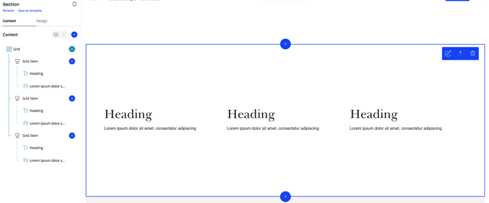
Grid with no source
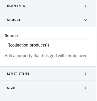
Source Fieldset & Iterating over an array
The Source fieldset enables you to add an array property to iterate over within the grid using layouts. In this example, the source fieldset is set to iterate the grid layouts over a the collection.products array:
Grid Layouts
Grid layouts work like any layout content item within an array:
- Your default layout will show by default for all items in the array you are iterating
- You can add additional layouts that show when the layout conditions are fulfilled
- You can add as many layouts as you would like
- When there are conflicting layout conditions, layouts take precedence from top to bottom based on how they are ordered within the grid
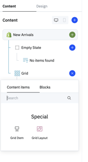
Unique Grid Items
Adding a normal Grid item within a grid with a source enables you to use Unique grid items in your grid. Unique grid items allow you to "break the grid" by inserting different grid items into the array you are iterating over at specific places. For example, if you wanted to add an image into a product grid like in the example below, you would use a unique grid item to do so:

To use this feature, you should toggle on the "Grid item is unique" boolean within the settings fieldset. In this example, the unique grid item will be inserted in the third position in the array:

- Paged: Divide grid items into discrete pages, displaying a set number of items per page with controls for moving between pages.
- Pagination fieldset options:
- Items per page sets the number of grid items that load on each page
- Alignment sets the alignment of the pagination controls
- Space to grid sets the distance between the bottom of the grid and the pagination controls
- Pagination fieldset options:
-
- Elements:
- Page Number sets the styling for the page number
- Previous and Next elements set the styling for the previous and next CTAs used to navigate between pages
- Elements:
- Load more: Use a load more button to load more items on the grid.
- Pagination fieldset options:
- Initial items sets the number of grid items that appear on the grid before load more is clicked
- Load new items sets the number of grid items that appear each time the load more button is clicked
- Pagination fieldset options:
-
-
- Alignment sets the alignment of the pagination controls
- Space to grid sets the distance between the bottom of the grid and the pagination controls
-
-
- Elements:
- Load more: Enables you to choose the CTA design token and configure the button text and width for the load more items CTA.
- Elements:
- Infinite scroll: Load more items on scroll. Infinite scroll also includes a feature that maintains a user's position on the grid when they click back on their browser so that the land in the same spot after clicking back. Infinite scroll is also only supported for grids in Source: Collection.
- Pagination fieldset options:
- Initial items sets the number of grid items that appear on the grid before the infinite scroll pagination kicks in
- Load new items sets the number of grid items that are loaded on each new page of infinite scroll
- Pagination fieldset options:
In order to use infinite scroll successfully, you need to follow a few guidelines in the configuration:
- The number of grid items in Initial load + Load more need to be equal, and the number of items you choose needs to fill the last row of the grid at the point you are paginating. For example, if each row of your grid has 4 grid items, you should set Initial load/Load more as a multiple of 4.
- Grids using infinite scroll cannot contain unique grid items as this can cause issues with pagination
- For best results, we suggest to add a maximum of one or two sections before the grid and don't add any sections after your grid
- We suggest to add an appear animation to improve how new grid items appear whilst the new page is loading